Creating a 50,000-foot view
My resume is a detailed look at my professional history; a detailed view. A Visual Resume adds infographic images to help someone get a wider perspective while showing my skill in Information Design and User Experience. Grab a sneak peek of the final result.
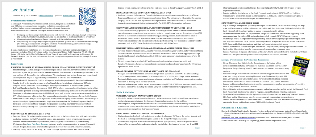
Resumes break when they get too long. My resume made it to four pages before I gave up and looked for a better way. Well… that’s not totally true, it made it to 3 pages that over-ran into four pages if I did not find a better way. I’d searched for a better way for a while, but it was elusive. And my most typically used resume I’d kept to three pages, but it took a lot of cheating to keep it to three pages. I’d adjust margin, type size, and line-height to an extreme degree to make space for all the text.
TEXT! – Text that nobody wanted to read. Text I’d written edited and re-edited, updated for new roles, edited, re-edited, updated for more new roles for more cycles than I care to admit. I’ve been using the same resume format for more than 8 years, it was stuffy and set for the Curriculum Vitae bin. When your resume gets over three pages it might as well be called a CV (Curriculum Vitae).
Design Thinking
There are two directions to go in design, the most common is incremental design improvements upon a system that is generally working. If the system doesn’t work and people abandon the process before they even get started, however, revolutionary design offers a path that abandons the assumptions that forced the prior system not to work.
Every design must work within constraints and therefore make assumptions about how limiting a path to success can be. I usability engineer six to remove friction from a process and enable a system to lead somebody to the achievement of the desired outcome. Blackberry was successful in part because of their keyboard design, ultimately it lead to the demise of the hardware keyboard, and took BlackBerry down with them because they did not pivot to a software keyboard fast enough. The key is to engage in revolutionary design before that blindside happens.
Evolution of the Double Diamond
If you have heard of the Double Diamond process you will know that the worlds’ most successful companies have used this process for more than 15 years (since before it was characterized as a double) to produce the world’s best products. Apple is famous for going through the “diverge and converge” (diamond) process at least 17 times.
Design Thinking was formalized with The Bauhaus in the early 1900s. The process of creating a refined design was closely guarded. After World War Two Churchill founded the Design Council to improve the quality of work the UK produced, that process produced quality found it’s way to the United States in the 1960s. In 1996 Bela Bethany proposed the divergence-convergence model. That lead to the Double Diamond process published by the Design Council in 2004. They’ve recently posted an update to the model that is more inclusive and clarifies Design Principles and makes it clear that design is not a linear process leading to a new model they call the Framework for Innovation.
There is a lot of additional info to unpack here but the key addition of these Design Principles:
- User-Centered Design: “be people-centered”
- Visual Thinking: “communicate visually”
- Co-creation: “collaborate and co-create”
- Agile / Lean Startup: “iterate, iterate, iterate”
This makes the model consistent with User-Centered Design practices everywhere.
Another resume option
A picture is worth a thousand words, and nobody wants to have to read 1000 words, if I can describe myself more easily with an image and at least supplement my main resume perhaps I can make it clearer who I am and what I bring to a position.
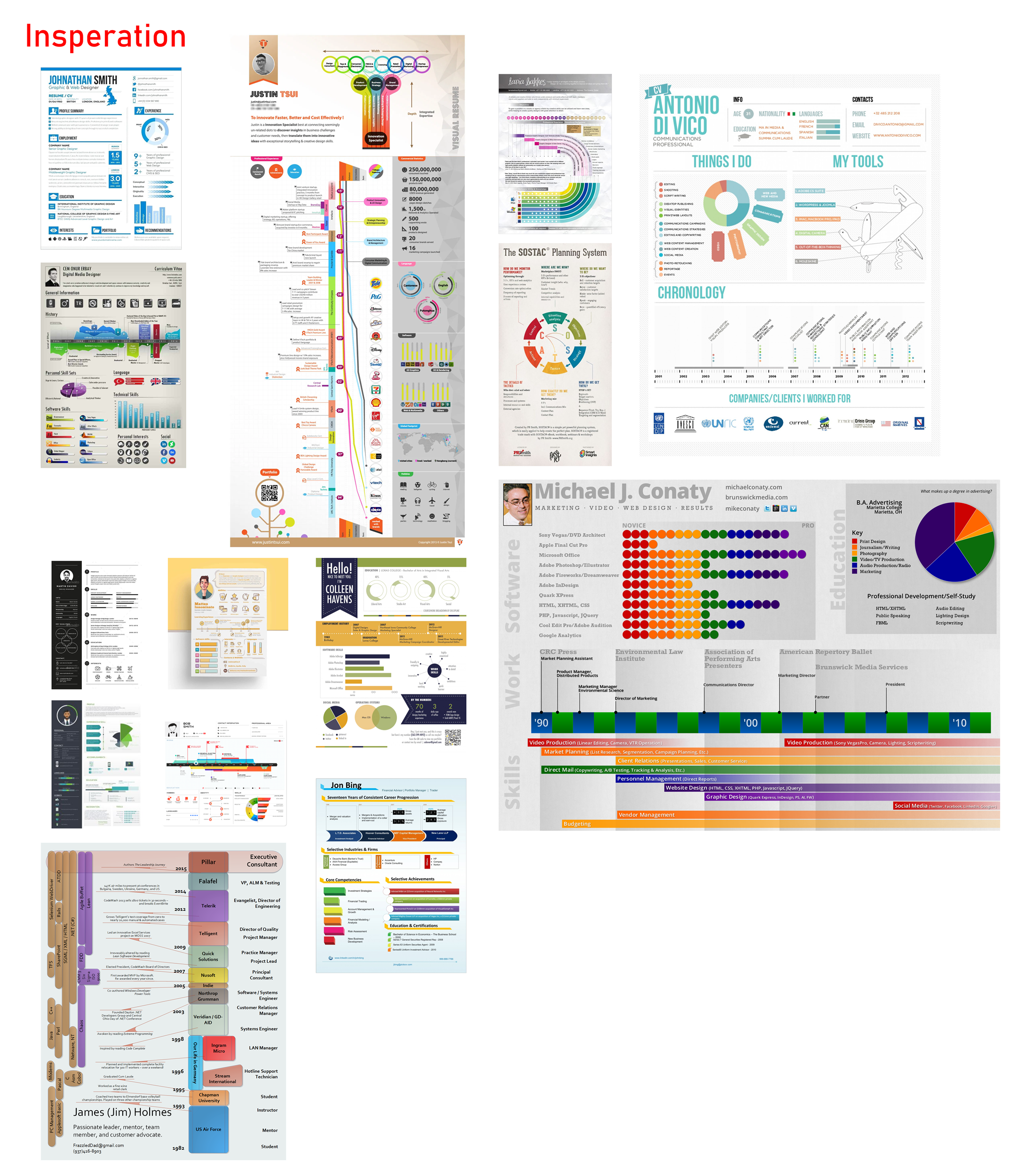
I sought out pioneers that describe their vResumes (Visual Resumes), the process they went through. Most of the Visual Resume creators (see bottom of this post) add a couple of additional visual elements to an otherwise normal resume. Some info-graphic creating tools like Visme can be used to augment a resume.
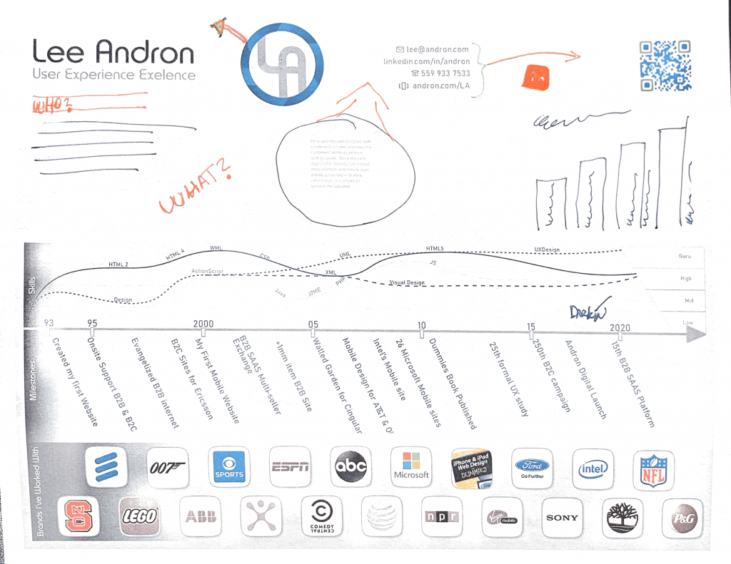
I wanted to move in the opposite direction and create a complement to my resume that would encourage job owners to see the big picture of what I bring to a role and make them want to dive into the deeper resume focusing on what was important to them. I wanted something that conveyed the maximum amount in a single graphic about my professional history. I reviewed about 100 visual resumes and took the best elements from the ones I liked the most:
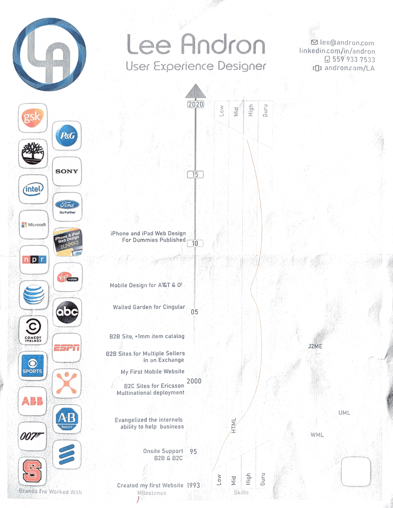
From there I sketched out my timeline. I chose to have time rise vertically and chose the starting point of my web design career, my first website, created some milestones like the book I co-authored.
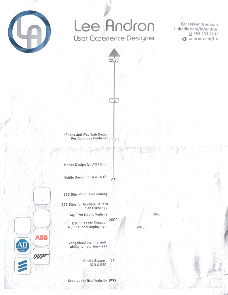
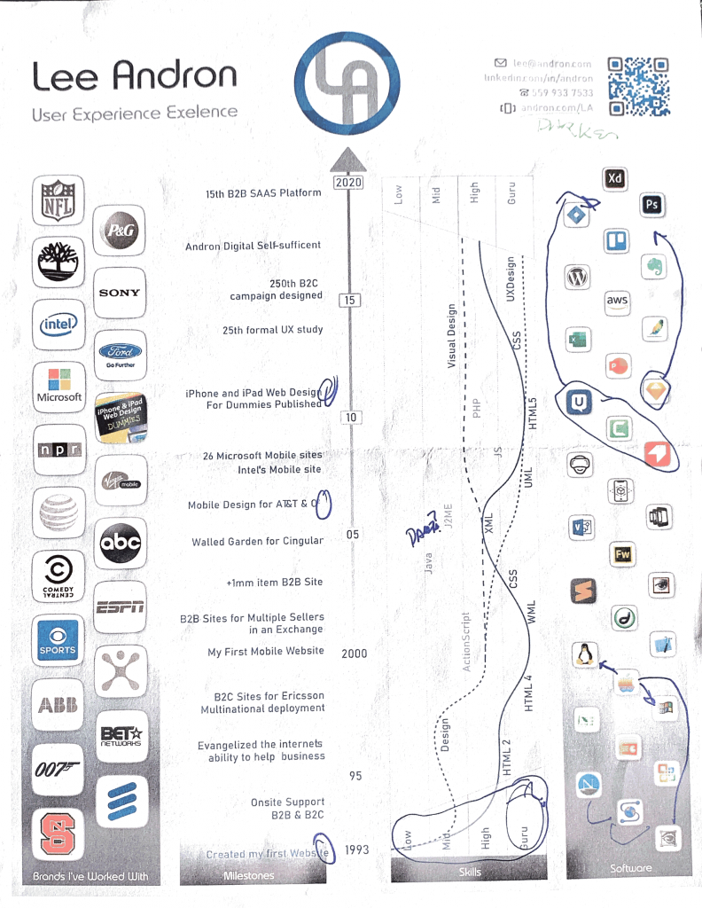
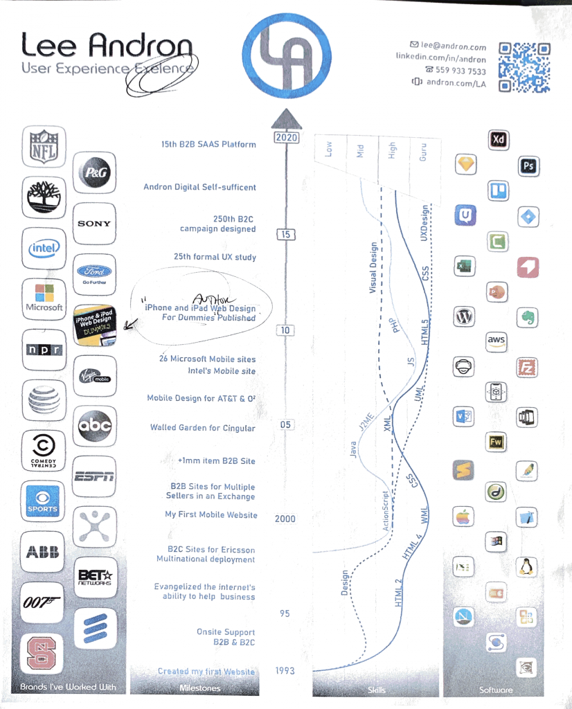
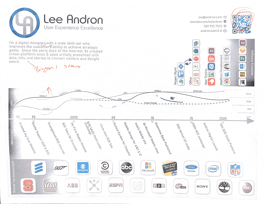
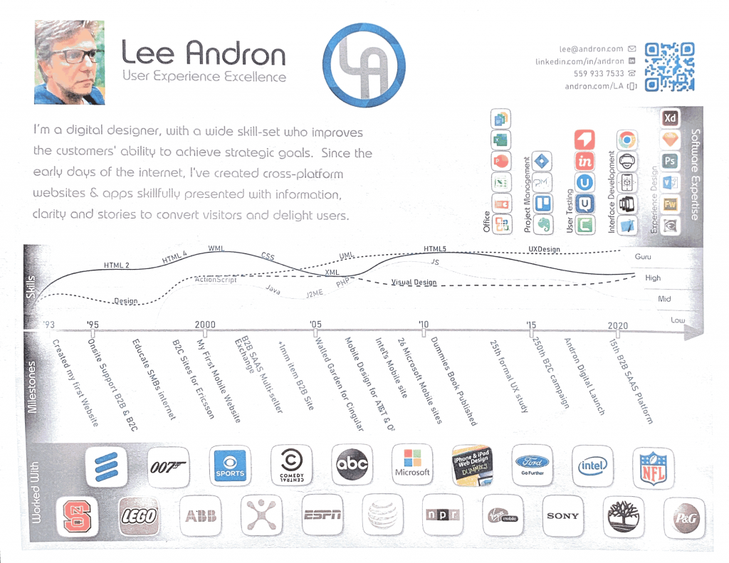
Talking with several people about the Portrait format I chose led me to realize that when people see the vResume for the first time, most often they will open it on their computer, limiting them to an area above “the fold”. That hides the area at the beginning of the timeline and makes it more difficult to get oriented to what they are looking at. This leads me to the second diamond and version two of my Visual Resume, reorienting everything to a landscape format that will allow people to take in the entire infographic at once to get the big picture.
Reorienting to a horizontal format enabled easier reading for the skills graph and marrying the timeline to milestones more easily. I borrowed the angle from the skill level and applied it to the milestones to fit more in and make them easier to read. I used inspiration throughout my career from the early days of reading
I changed the software I used to accomplish tasks into a bar graph that shows my level of expertise in the area in which the software is applied. This enables me to show 2 dimensions of information in a single image. The software area is more compact this way and it leaves space for two sentences that describe who I am as briefly as possible.
I used lots of things I learned over the years. The skills chart starts with three lines and ends with four. The dashed design line shows my experience with design, around 2000 I realized that I was more of a functional designer than an ascetic artist, form follows function from my perspective.
One design detail was how to label the skill line. Tufte talked about the ideal label for rivers on maps in his seminal text Envisioning Information. It was close to the line, did not follow the curves of the river to break the line of text, and was on top consistently.

Another design detail is my use of negative space to define the four sections. The timeline in the center is true for the brands I worked with, milestones, skills, and software. item described deftly by Tufte:

In conclusion
The vResume has enabled me to give people looking for Usability Designers a quick overview of the key points of my career over the last 25 years. It makes it easier to digest my resume and provides supplemental information to help round out the question of my design process, this is a great example of how revolutionary and evolutionary changes happen in the design process.