How to map out an app
I needed a way to describe what I found in an app, I’ll use insight Timer as an example. Step one, get screen shots and add them to figma.
Organize according to entry and Nav…
Many of your screens will need to be added together to show the full length. Stack them and crop quickly with the Command Key or Control key in windows.
You can also set the transparency to 50% quickly see how your images line up:
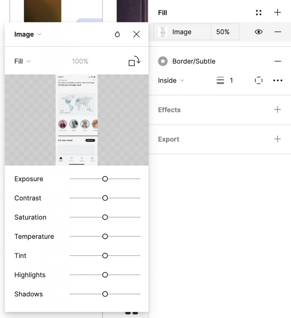
Lining things up is easier sometimes with translucency.
You can change transparency quickly with your object selected, hitting 1 for 10% opacity, 2 for 20%, and so on to 0 for 100%.
I change the image fill opacity, but we do get a variety of ways to adjust transparently in the popup: Exposure, Contrast, Saturation, Temperature, Tint, Highlights, and Shadows.
Once it’s lined up, 0 takes it back to full opacity.
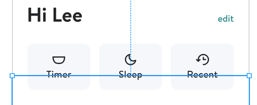
Lining up the home page and the main navigation pages is the next step in creating the app walk through:
The final overview of the layout
Now I can show how people move through the app
Figma, is closer to a browser than Photoshop.
Icons were ment to be used.
Lee Andron
Figma is web native, so all the Components, Frames, files, and Projects have an unique URL. While working on the Edison Design System I recreated the Icons in the system. In the Sketch design system, they were organized by subject matter. Through a card sorting exercise, they categorized the icons in a way that made sense to the designers.